American School of Bombay
Branding
Modernising educational design with American School of Bombay
American School of Bombay was established in the year 1981 in Mumbai and it is a co-educational, independent, IB day school from Pre-K to Class 12. They are an established institution with set core values and a logo as well as brand identity. Truetype worked with team Magenta who commissioned us for a rebrand to become more modern and up with time in their visual communications.
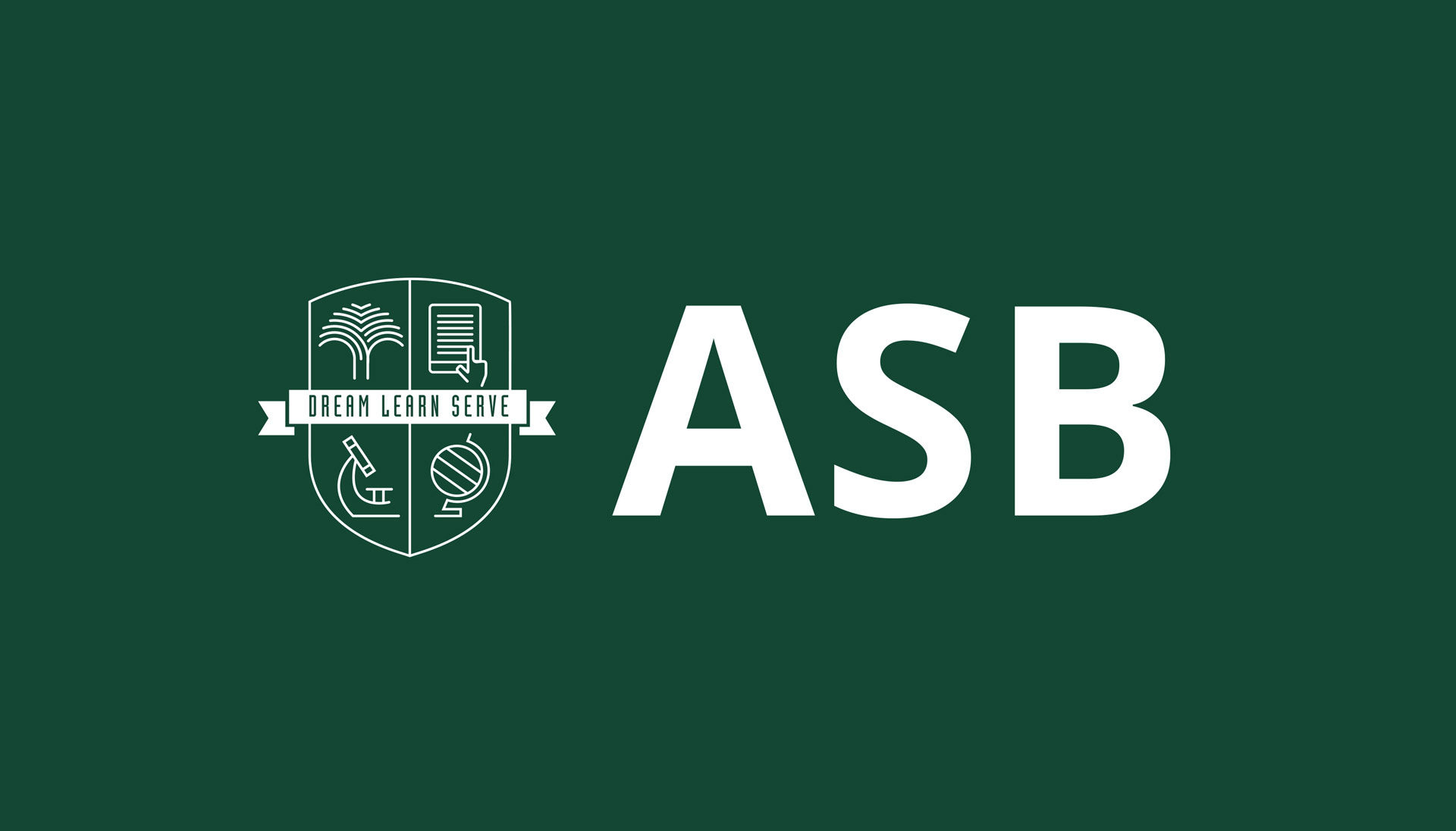
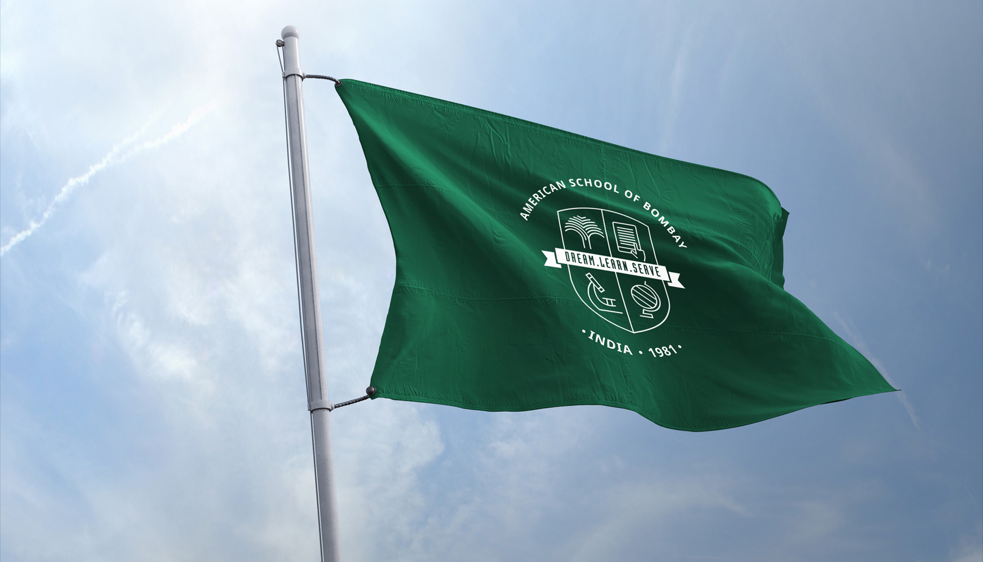
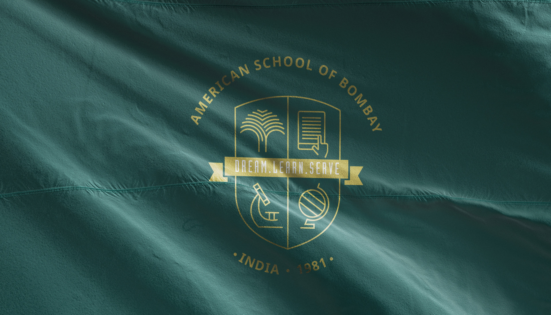
While most brands will not use an abbreviation in a logo, ‘ASB’ became one of the biggest changes to establish a contemporary identity for them. Their original logo was an emblem with a herald that has four elements – the Bodhi tree, a book, an atom, and the globe – and two concentric circles surrounding the entire unit. In the new identity, we’ve incorporated the same logo elements but made them contemporary and developed the visual language for the school’s communications around that.
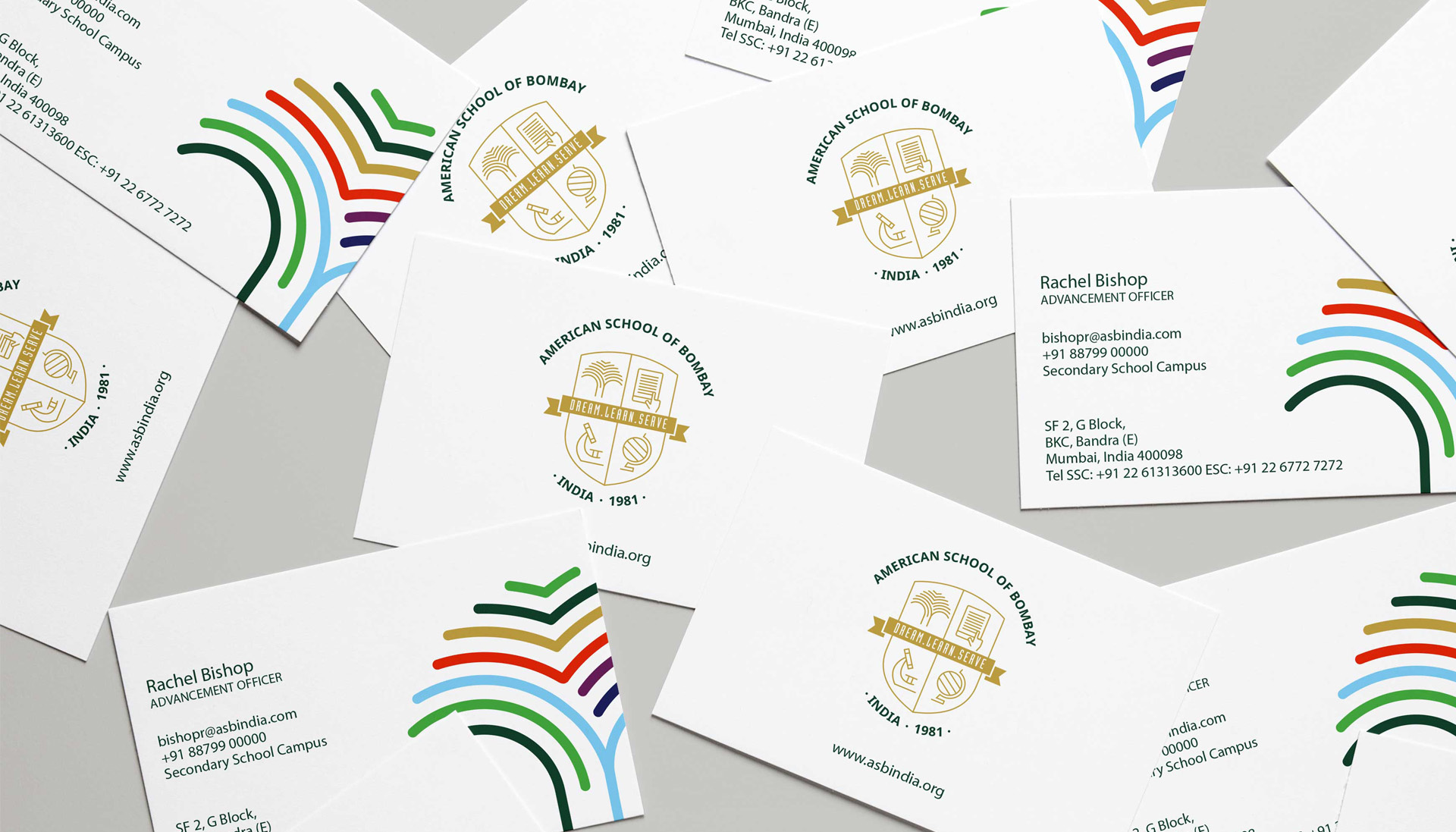
Three of the four elements – the tree, the book, the atom, and the globe were modernised with a minimal icon approach to keep pace with the current times, except the atom, which was replaced with a microscope in the new identity. The typography of ‘American School of Bombay’ is set in Noto Sans font and arched typesetting that forms the outer crest of the logo replacing the two concentric circles from the old one. The ribbon inside the emblem – Dream. Serve. Learn – uses a condensed font corresponding to the icons in the herald.
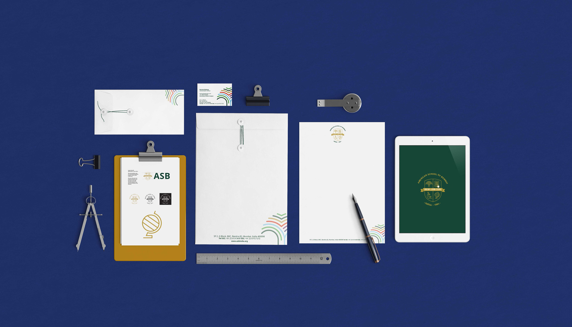
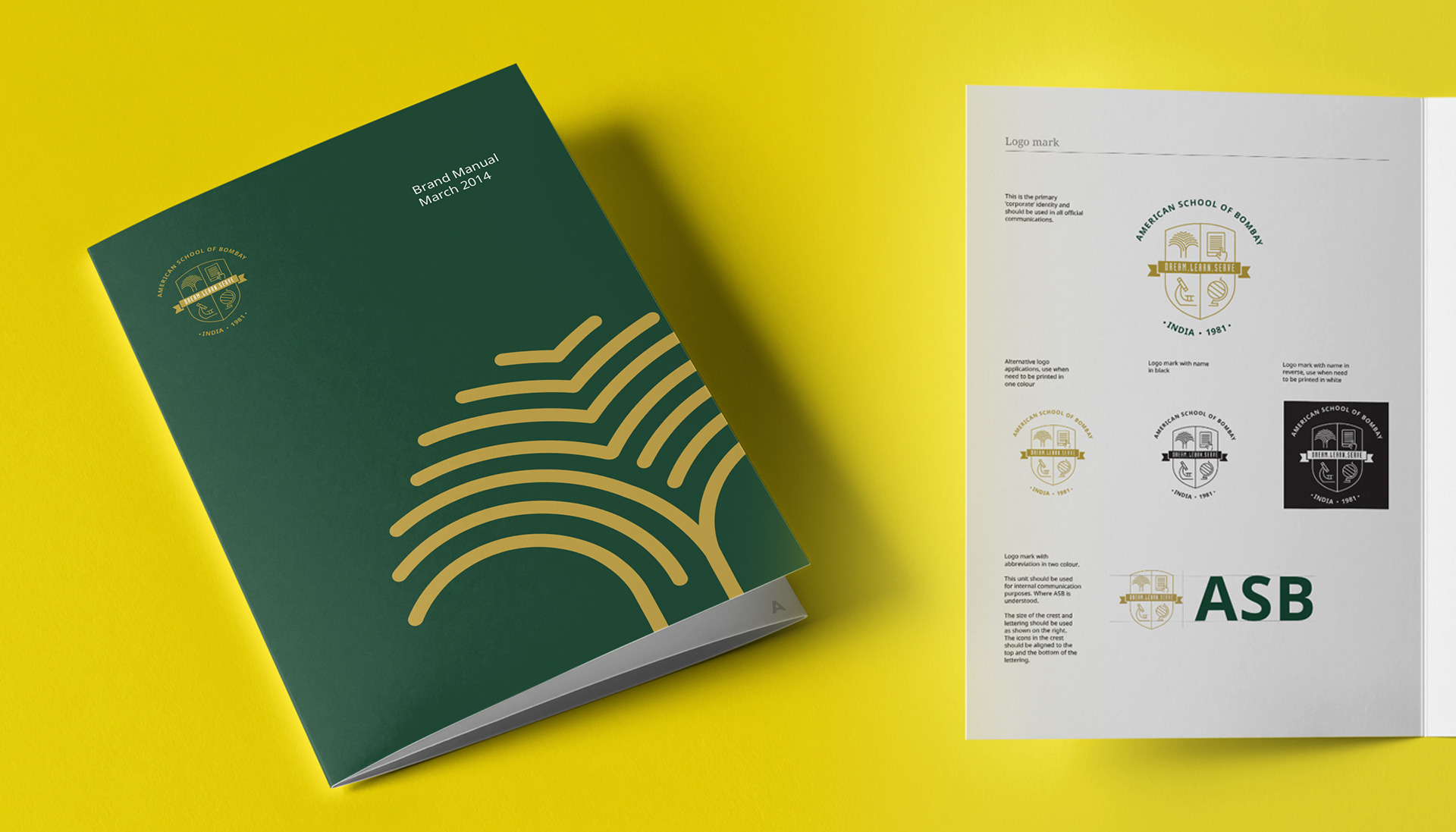
We also worked on an abbreviated logo for ASB that could be used in instances that have a space constraint. A peculiar request we fulfilled in this project was providing a concise and apt three-page brand manual that the school can print and distribute with all their stakeholders and collaborators to better instruct them about the visual language execution.

While most brands will not use an abbreviation in a logo, ‘ASB’ became one of the biggest changes to establish a contemporary identity for them.
