Asian Paints X Architectural Digest India
Book Design, Editorial Design
Showcasing the talent and art of architects and designers
Architectural Digest India is a Condé Nast publication that covers interior design and landscaping as its primary subjects, and they commissioned Truetype to design their and Asian Paints’ collaborative annual coffee table books for three consecutive years.
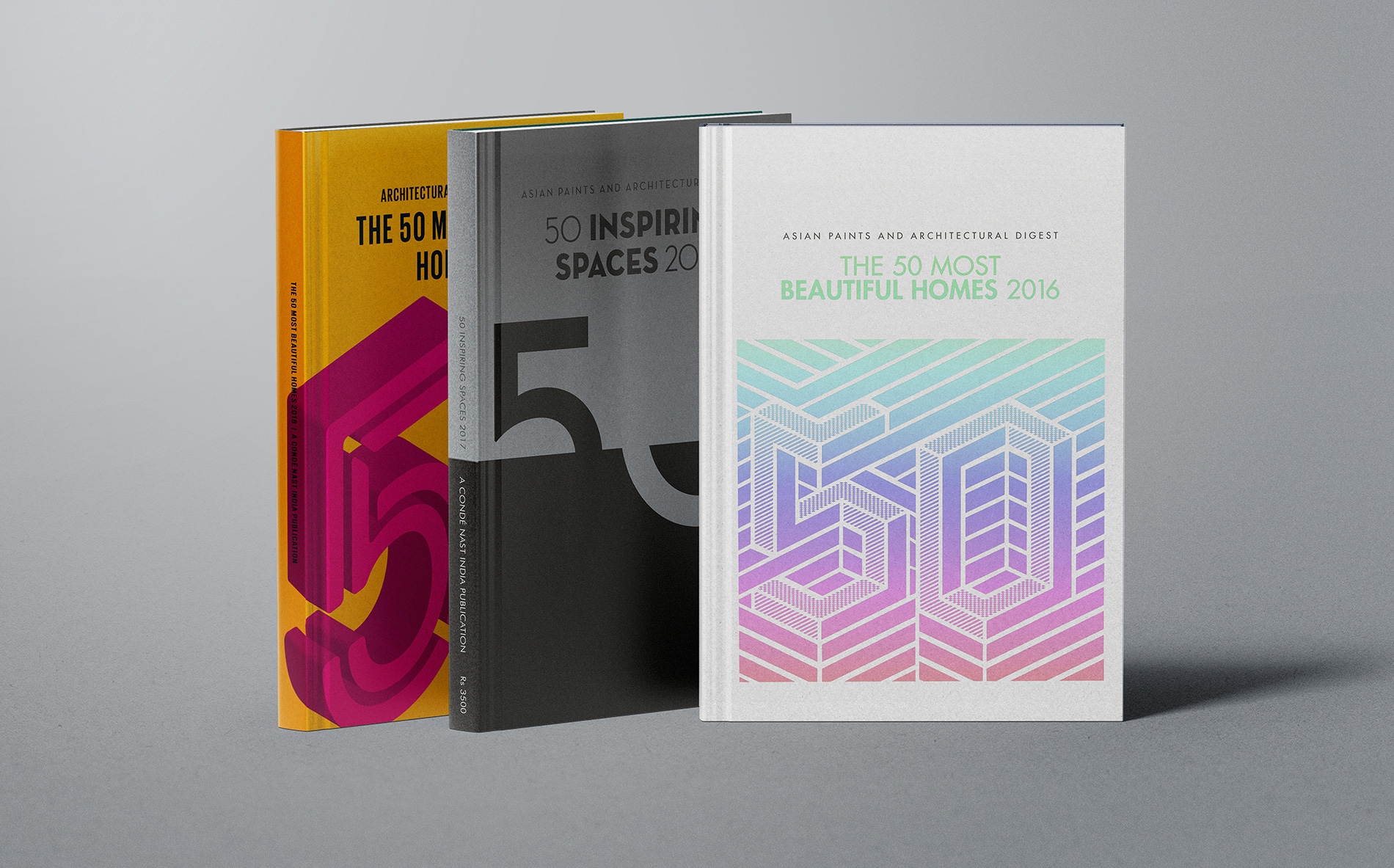
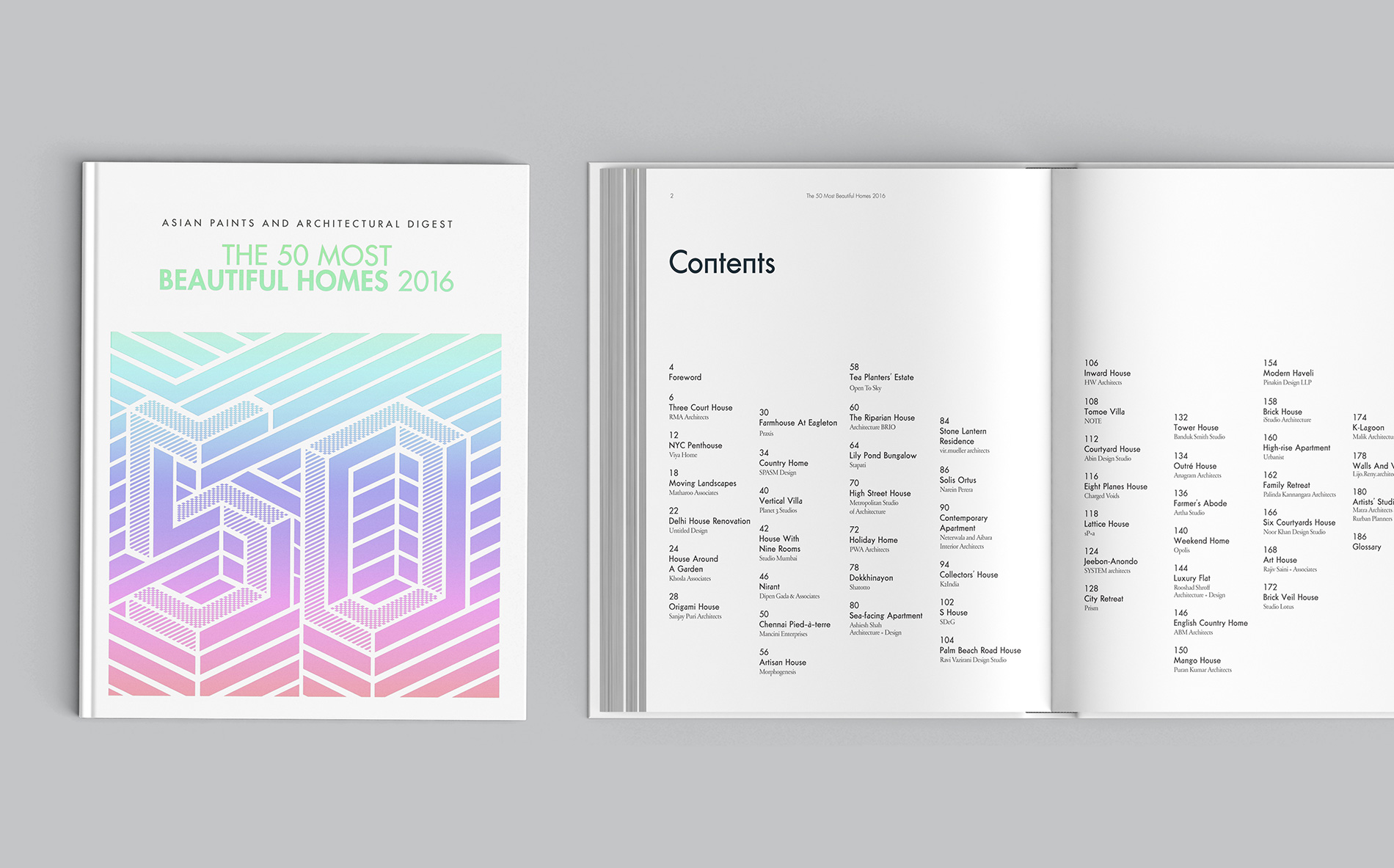
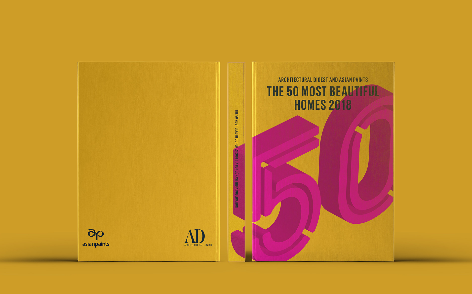
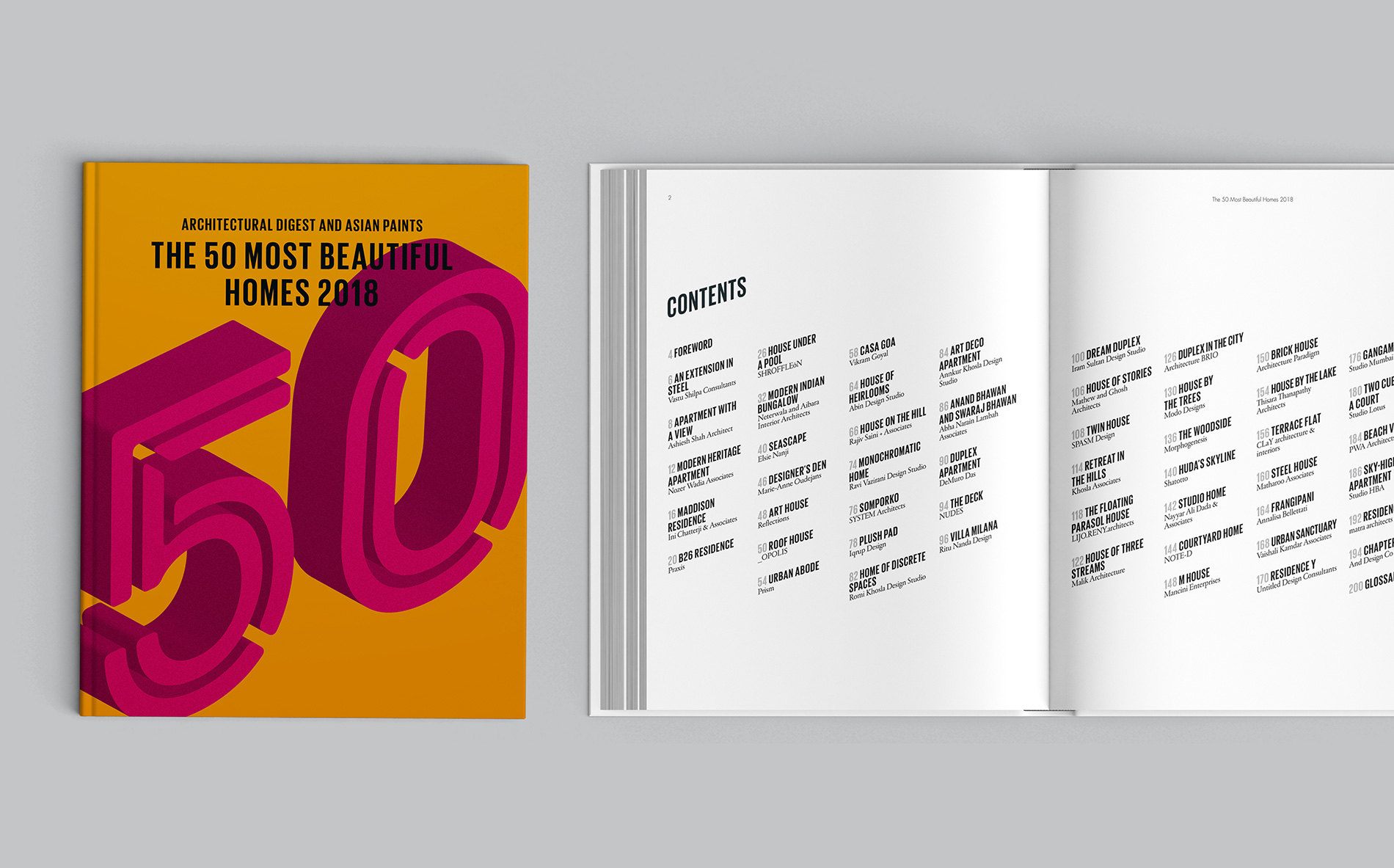
The issues featured the 50 most beautiful homes in India, Bangladesh, Pakistan, and Sri Lanka by talented architects and designers. The books are hardbound of A4 size with the dust jackets designed with a graphic interpretation of the number ‘50’ in foil and do not feature any home to be impartial. In the 2016 issue, the ‘50’ is a floor maze and in the 2017 issue, it is designed like the negative and positive spaces of home interiors – all of which portray the elements of architecture and interior design. The 2018 issue has a more literal representation of the number ‘50’ but it is treated in 3D graphics that correspond to the contents pages with similar shear typography where the words are essentially rising up.
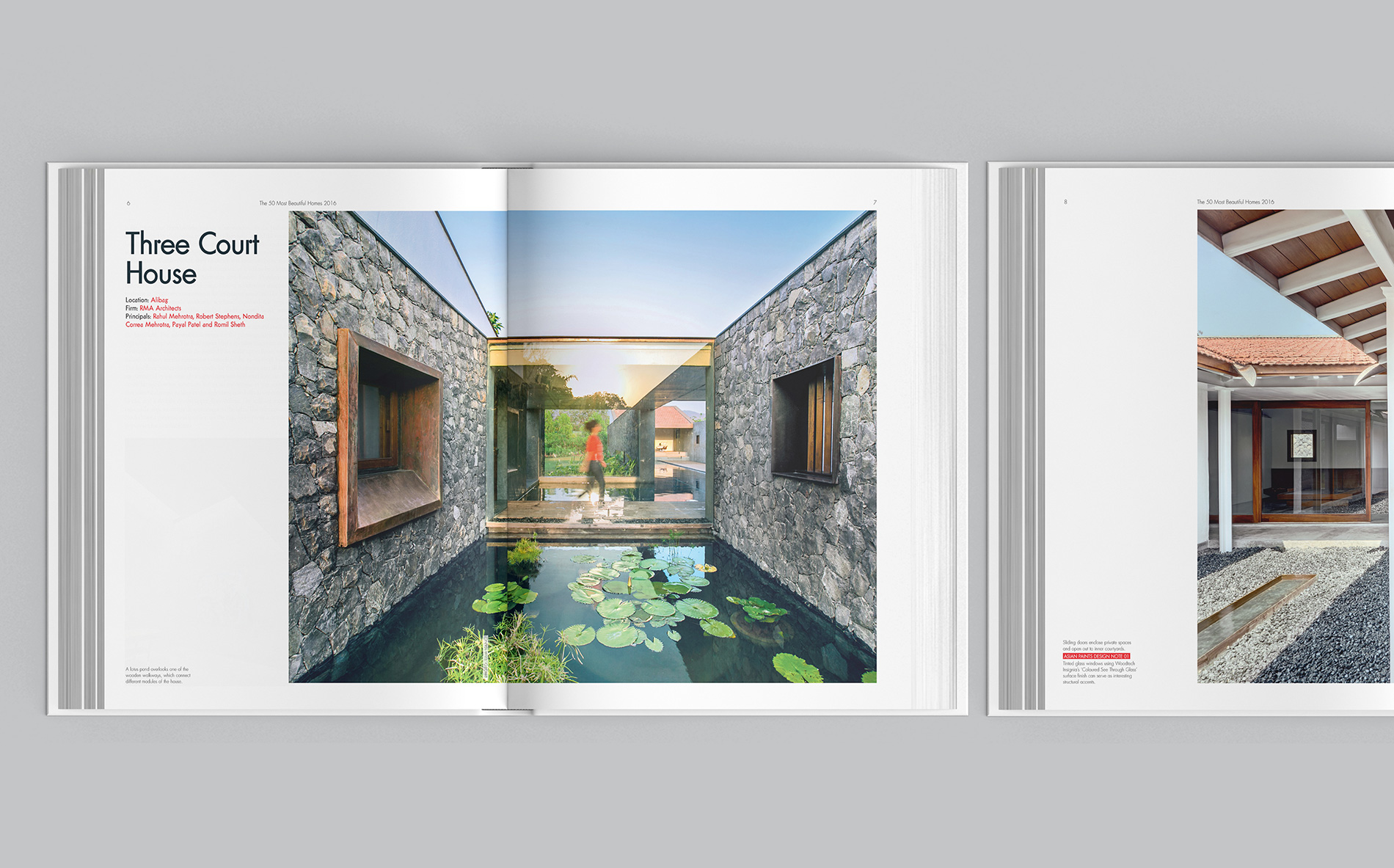
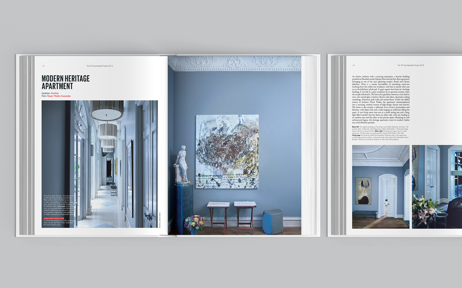
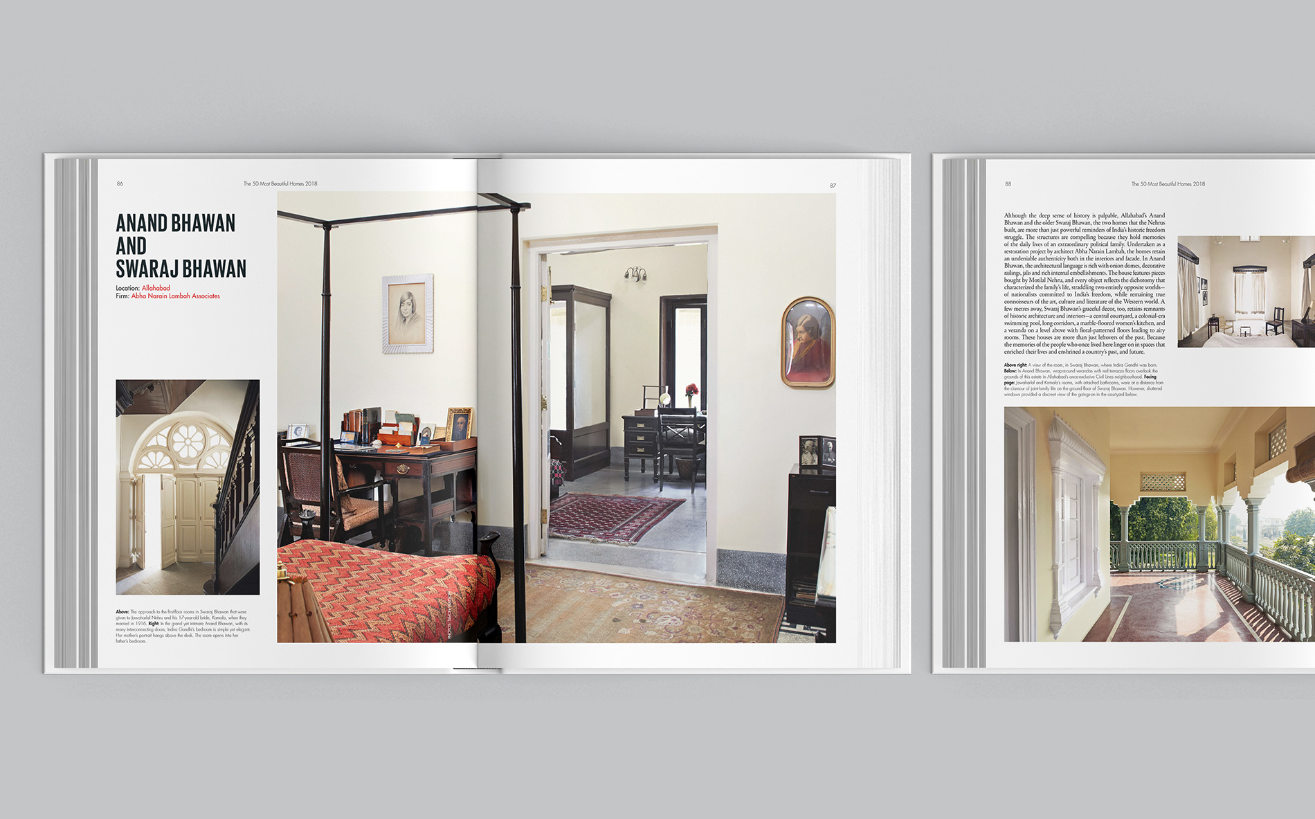
The spreads are designed with a carefully curated selection of images that best showcase the architectural and interior design details of the space – all designed individually for each home and then put together in a running order for the book. The typography renders the design an edgy and contemporary look just like the homes that are featured in it. We used Futura Classic, Cut, and Giorgio in the 2016, 2017, and 2018 issues respectively and the body copy is Futura across.
The books offer a small glimpse into the burgeoning talent of the architects and designers as well as the refined tastes of the homeowners of the subcontinent, brought together by Architectural Digest India and Asian Paints.

The 2018 issue has a more literal representation of the number ‘50’ but it is treated in 3D graphics that correspond to the contents pages with similar shear typography where the words are essentially rising up.
