BTG Advaya
Branding
Two distinct identities; one seamless merger
BTG Advaya came to be after the merger of BTG Legal with Advaya Legal in 2023. BTG Advaya approached Truetype for a renewed visual identity for their brand new company.


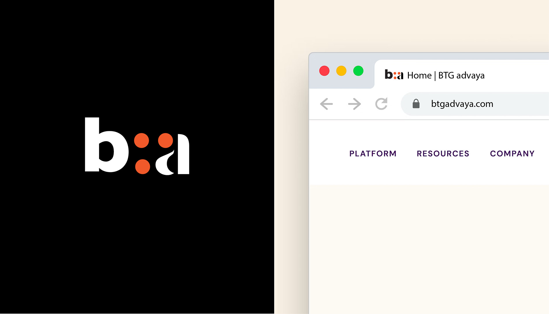
Our execution was an effortless conjunction of the two distinct identities. BTG being a multi-national company with international roots while Advaya, from the name itself gives off a distinctly Indian, Sanskrit essence. Their joint identity too was a seamless merger of the two, the traditional with the modern using three dots.
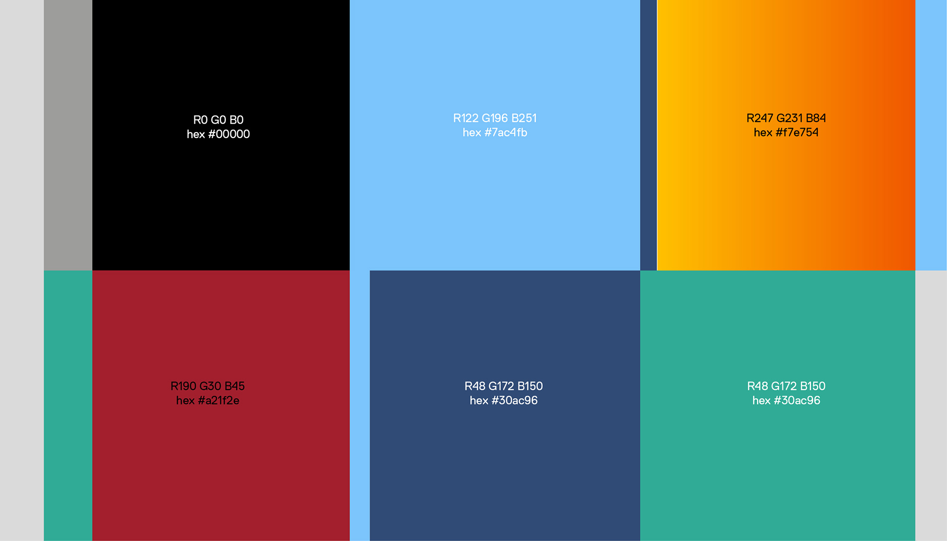
These distinctly orange dots have been purposely kept numbered to three, the fourth dot being the bottom half of the ‘a’ from Advaya which helps showcase the merger as more than just a coalition. It’s an amalgamation of two unique identities and ideas.
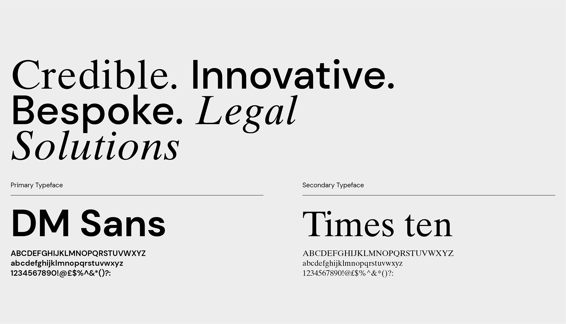
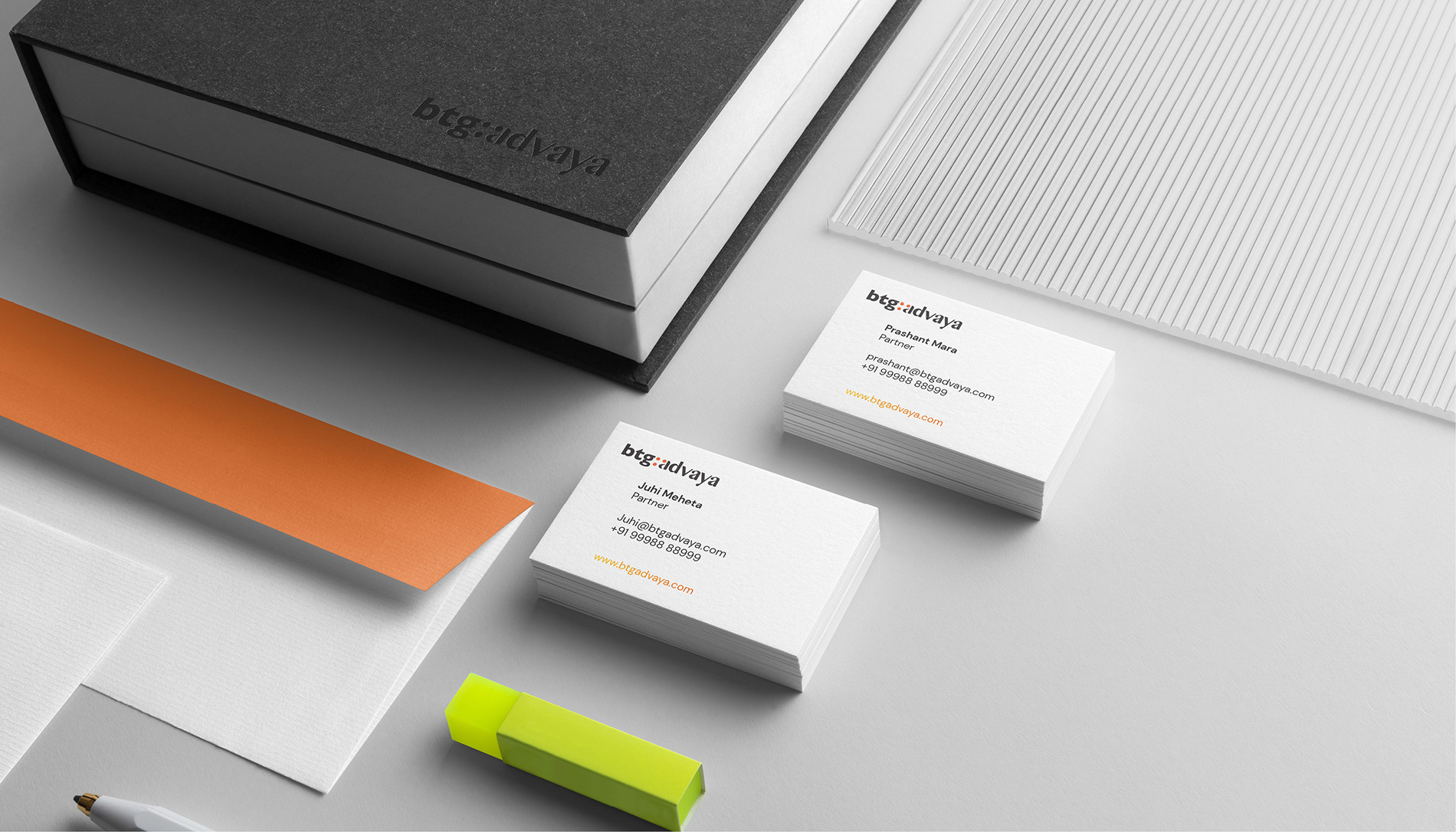
Two bold typefaces are used for this juxtaposition, the DM Sans font which is used as the primary typeface while Times Ten is used as the secondary typeface. This new identity seamlessly shines through all of the company’s communication, giving a fresh kickstart to this new merger.


Their joint identity too was a seamless merger of the two, the traditional with the modern using three dots.


