Haute Islands
Branding, Digital Design
Booking a private island is one click away
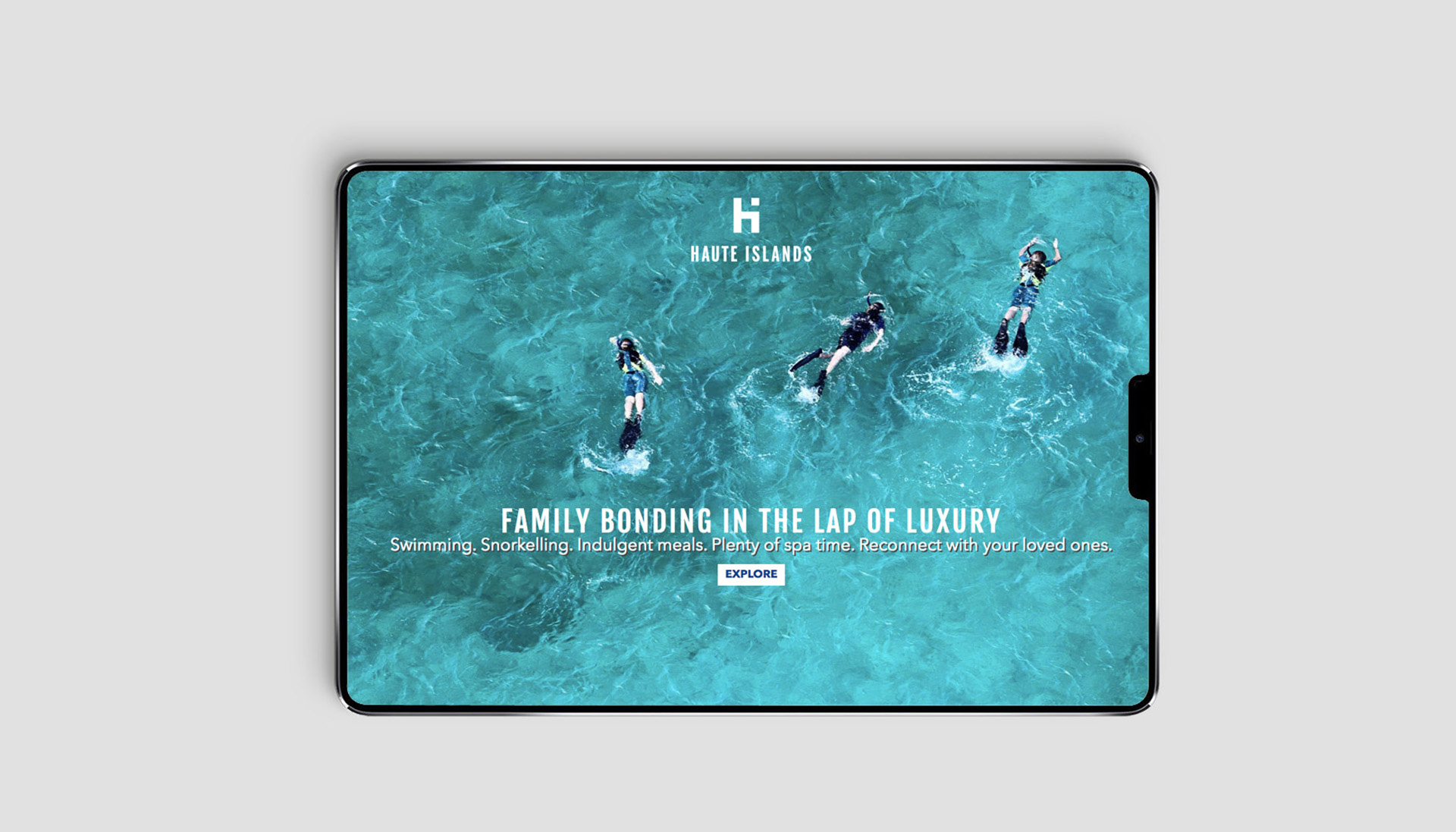
Booking a vacation with an agent or booking a property is the usual experience when planning a holiday. What if you can book an entire island for yourself? Haute Islands brings you just that and they commissioned Truetype for their branding and identity systems development as well as their website design.

As a part of building their branding systems, we designed the monogram, the primary logo, the secondary logo, and a responsive logo. The primary logo’s marque was designed as an amalgamation of the small case ‘h’ and the title of ‘i’ which also represents an island away from the main land mass. The logo is simple, elegant and uses a condensed font that hints to the luxury and premium service Haute Islands is.
This project is the first where Truetype designed a responsive logo. Undertaking a unique approach, we decided to ask all the founders of Haute Islands to tell us one element that they think represents an island. All the answers – a palm tree, a surf van, a coral, and more were designed as watercolour illustrations and placed as the background of the secondary logo that add to it a colourful and playful graphic element. This execution is reflected in the stationery of these individual founders having their very own printed logo of HI. This approach is beneficial for an online business and adds to the quirky and youthful nature of the brand.


The primary logo’s marque was designed as an amalgamation of the small case ‘h’ and the title of ‘i’ which also represents an island away from the main land mass.


