Snackible
Branding, Packaging
When intuitive eating meets great packaging
Snackible came to us with a vision to redefine the way we snack—creating options that are delicious, guilt-free, and convenient for today’s fast-paced lifestyle. As their packaging design partner, Truetype worked closely with the brand to ensure their identity and packaging was as bold and vibrant as their snacks.
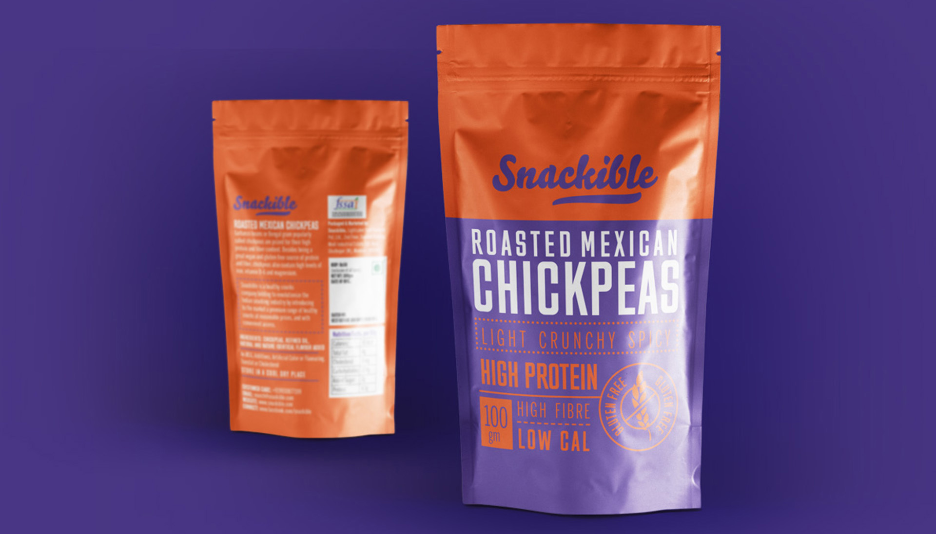
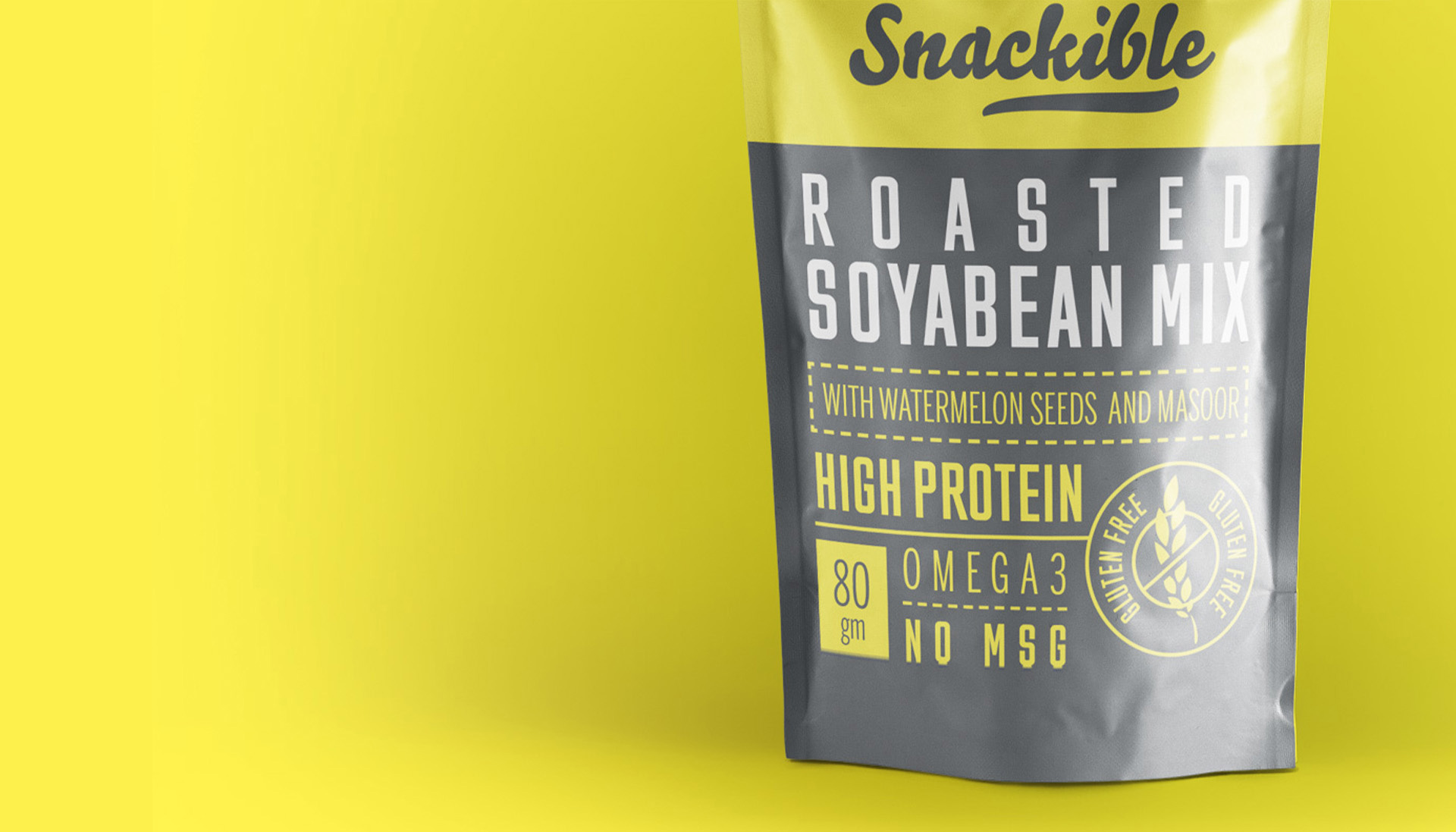
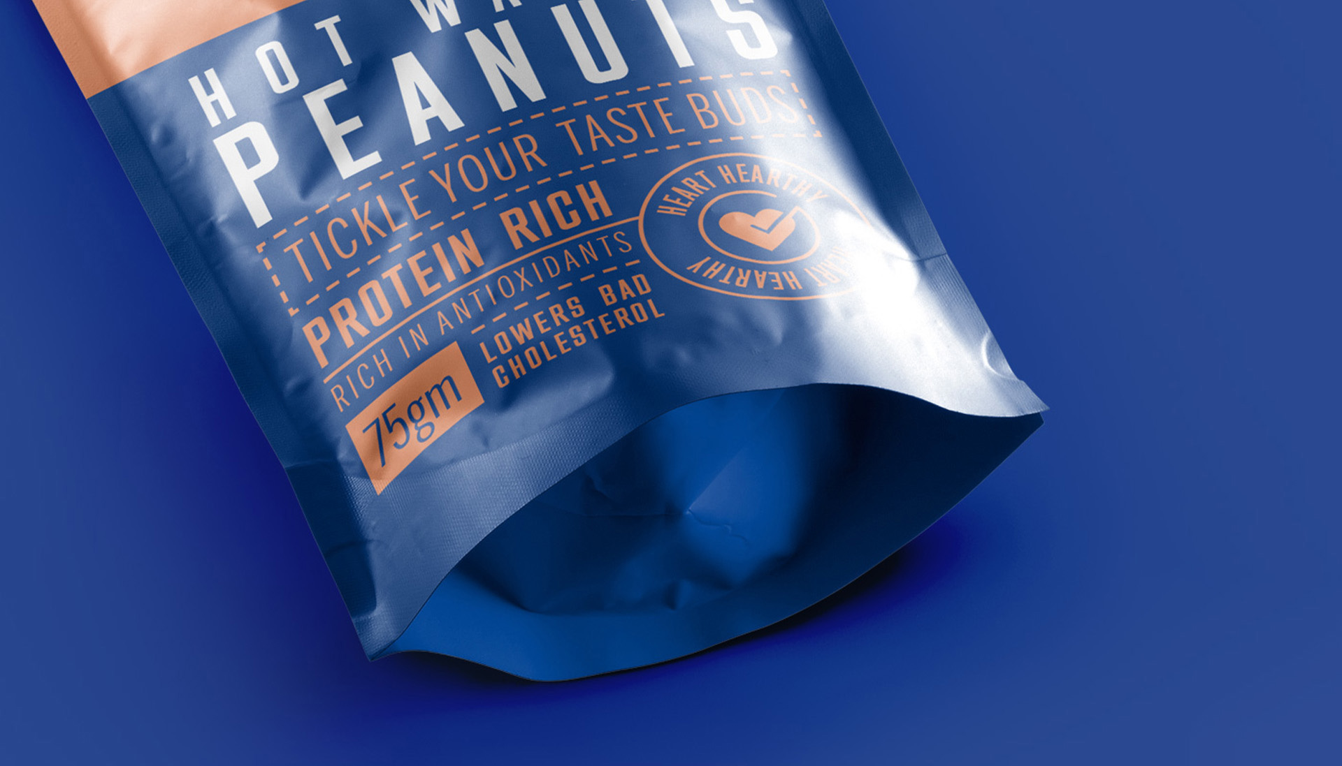
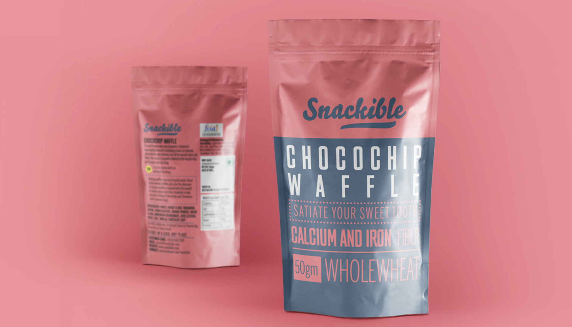
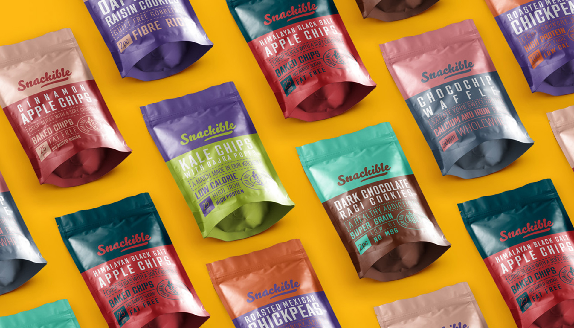
Our challenge was to craft packaging that would reflect Snackible’s playful, healthy, and innovative spirit while also making it irresistible to grab off the shelves. Inspired by their commitment to quality and flavour, we designed a visual identity that captures the essence of each product. The result? Packaging that’s a burst of colour and energy, tailored to resonate with modern snackers. The big idea was to bring out the contents of the snack from the back of the packet towards the front, so people KNOW what they eat.
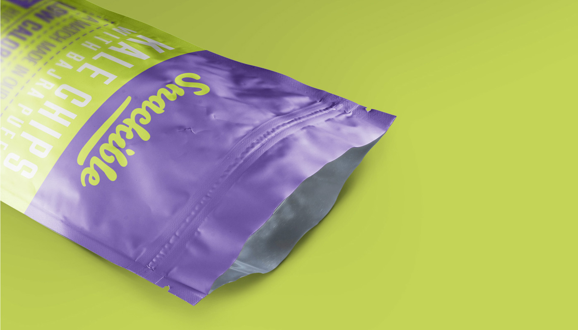
This way we balanced form and function, ensuring that the design was not only eye-catching but also practical. From resealable pouches to easy-to-carry packs, the packaging is made to fit seamlessly into the on-the-go lifestyle of Snackible’s customers.
Each package tells its own story-whether it’s the indulgence of their Kale Chips or the irresistible ragi cookies. We brought these stories to life through bold typography, clever illustrations, and playful colour palettes, all while maintaining consistency with Snackible’s approachable brand tone.
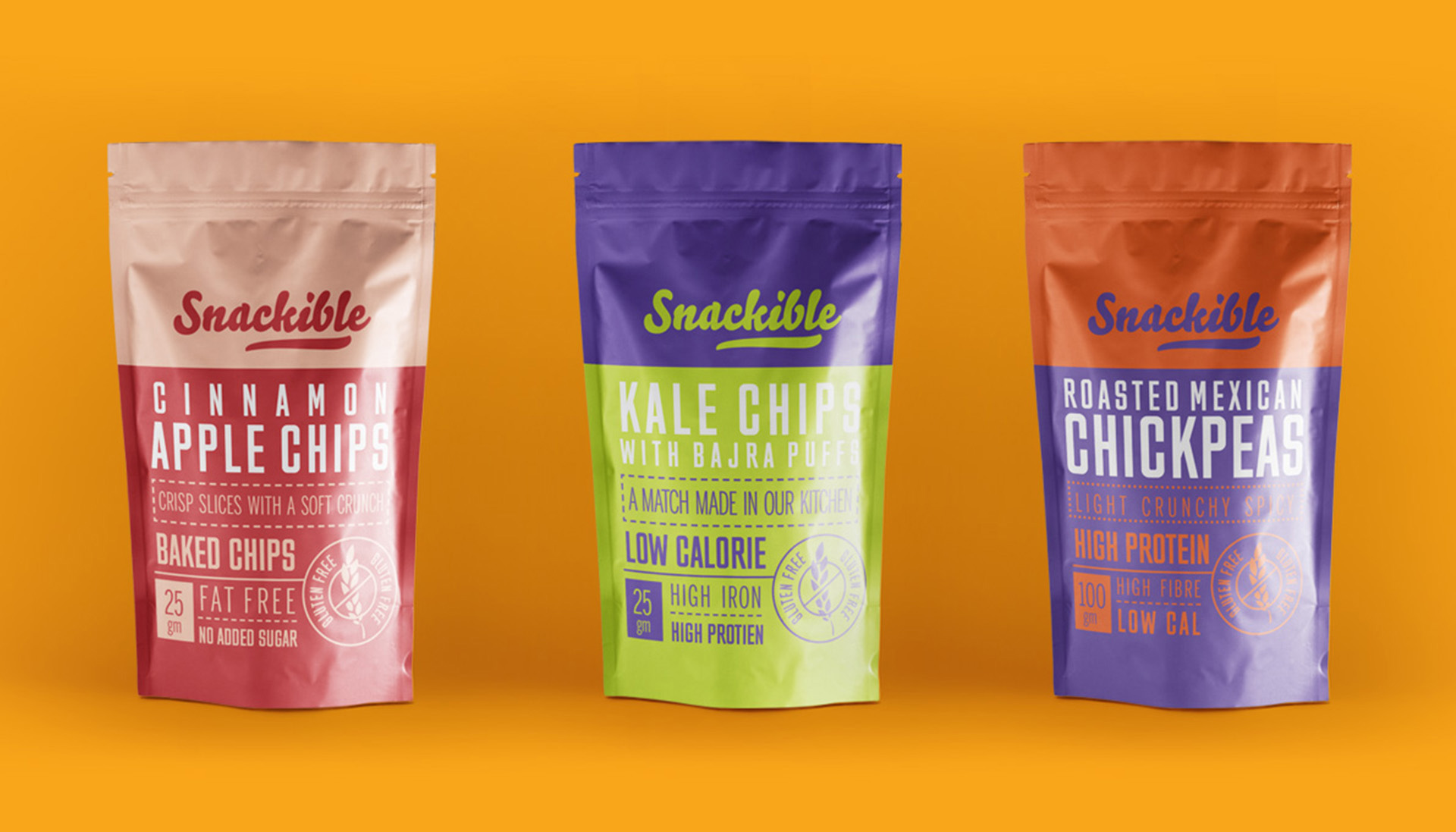
Packaging that’s a burst of colour and energy, tailored to resonate with modern snackers.
