Suryavilas
Branding
Crafting an identity that’s rooted in holistic wellness
Suryavilas is a wellness retreat in Solan, Himachal Pradesh. The idea of the retreat is rooted in Calm, Care and Cure. Suryavilas approached Truetype for a distinct visual identity that is true to the place and its core philosophy of wellness and harmony.
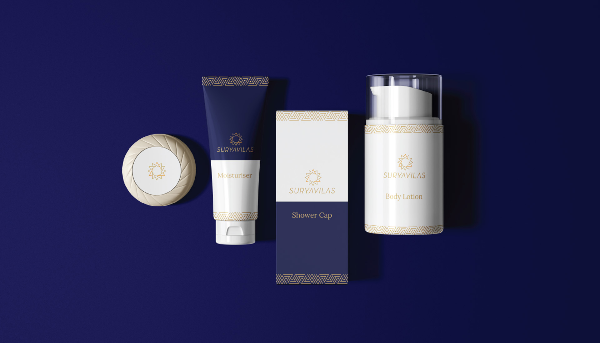
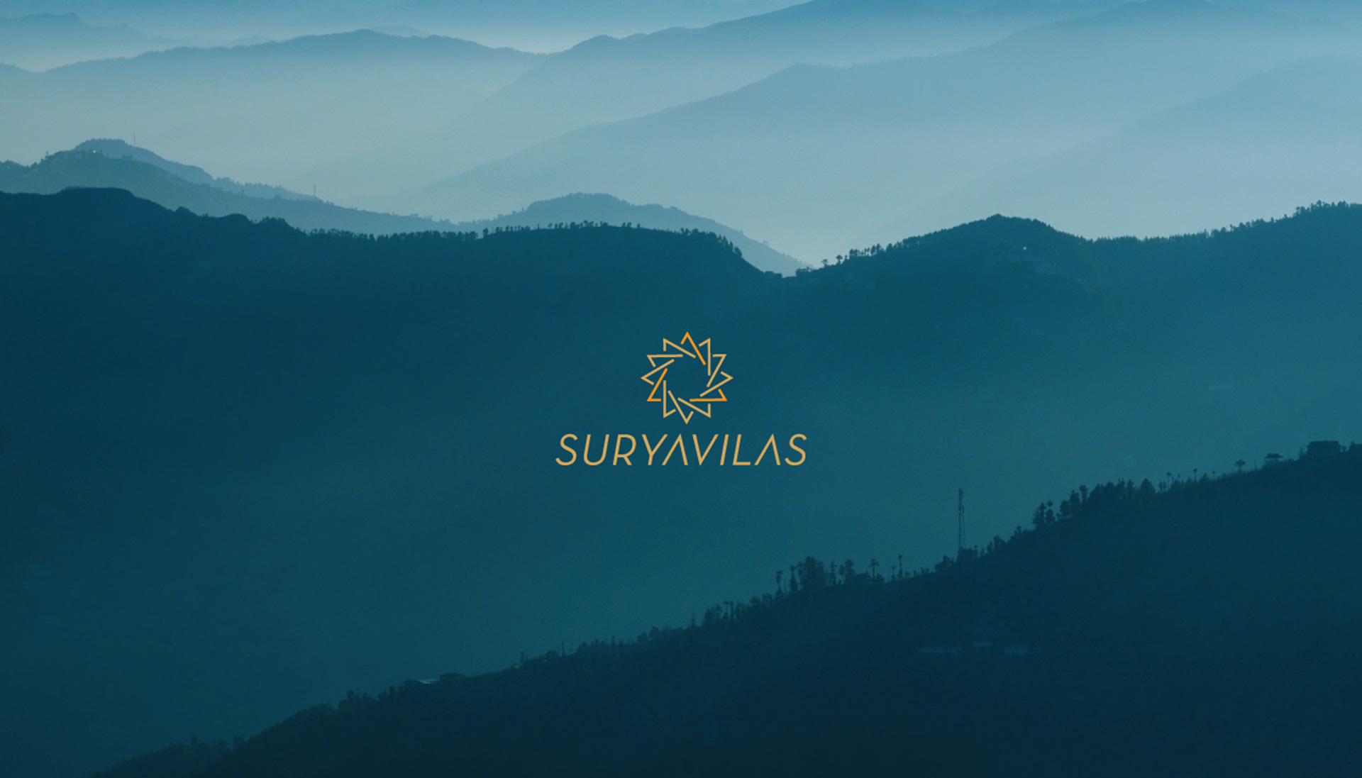
Suryavilas means the sun’s abode, hence the sun has been used as a primary element along with the Indian Chakras which have always been associated with holistic wellness. The seven chakras like seven triangles create a logo that balances and harmonises everything out perfectly. In terms of ways of looking, the triangles that form the chakra also represent the everpresent mountains, a homely abode and balance.
For the colour palette, bold, energetic and warm shades were used. The combination of yellow and purple sets the balance just right for the shapes and for visual balance. The bright purple radiates energy and provides a strong contrast to the yellow of the sun. A warm serif font as the primary typeface goes well with the overall communication of the brand and sets off a strong identity. Lora a classic serif makes this communication look approachable while Montserrat suits the secondary font perfectly well.
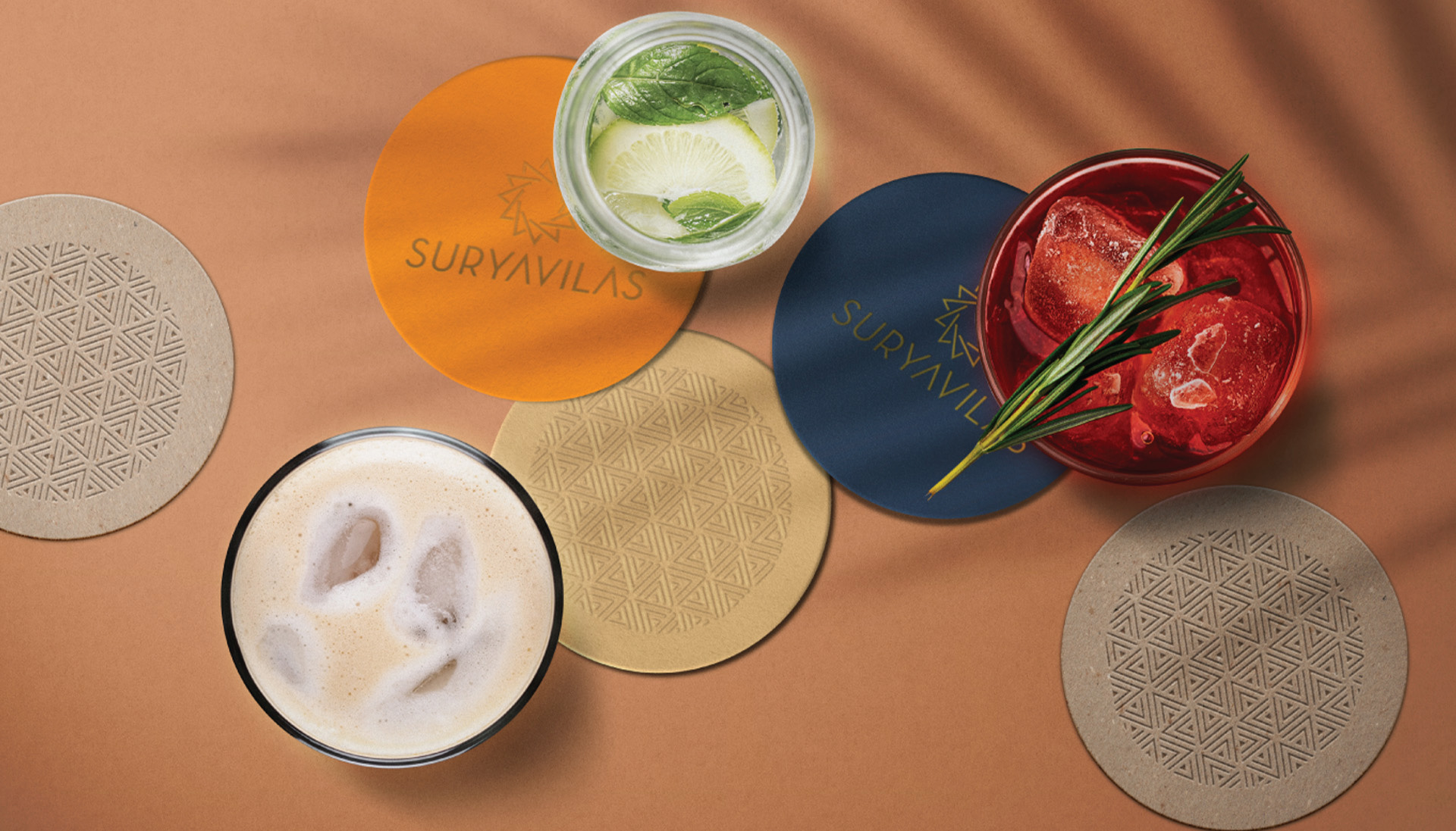
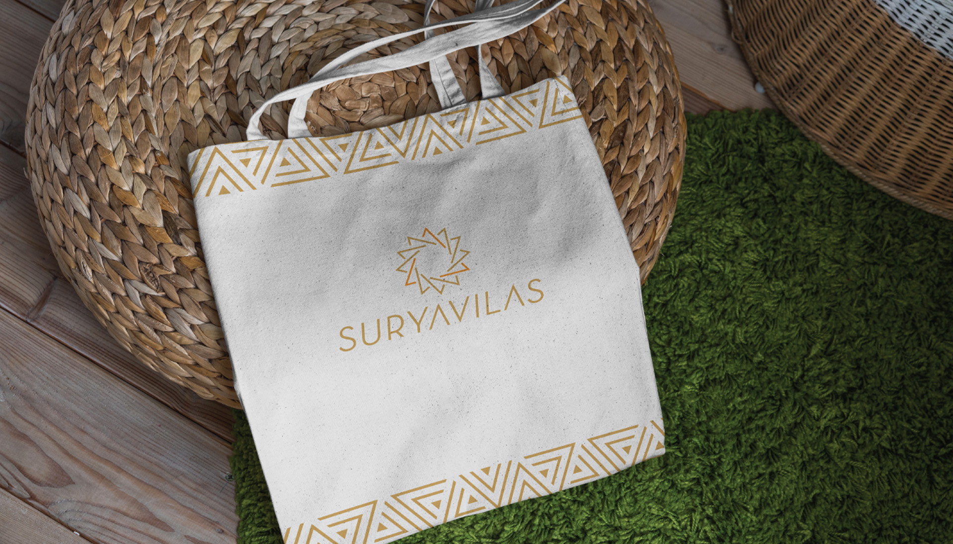
The overall communication hence, effortlessly brings out what this wellness retreat is truly about, serenity. The serene visuals seamlessly come through and create a strong visual vocabulary for the brand, even on something like a door hanger, the detailed and cohesive branding doesn’t fail to stand out.
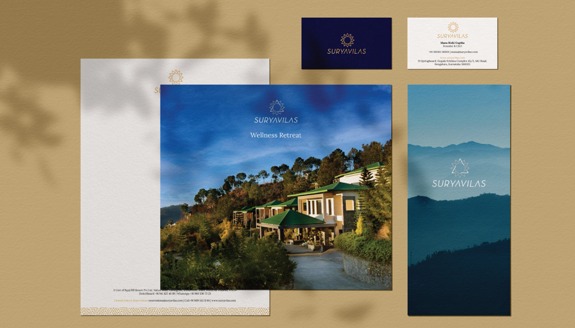
The seven chakras like seven triangles create a logo that balances and harmonises everything out perfectly.
