Thackers
Branding
Identity system inspired by the sea and the horizon
Thackers is a real estate company based in Mumbai, of the Dilip Thacker Group that tracks back its lineage to three generations to the 1950s.
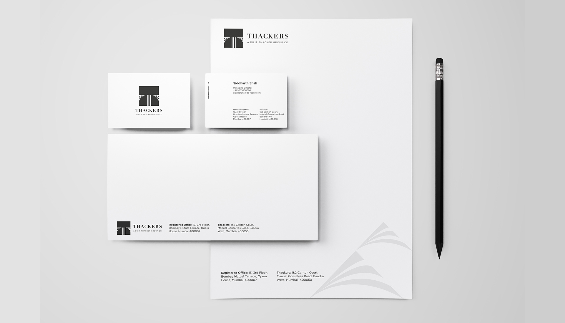
Truetype was commissioned for developing the brand identity systems for the new Thackers real estate business. When we talk about the logo system, it is the letter ‘T’ that is represented in three strokes standing for three generations and a wave of change that each of them brings, making it a robust crest-like monogram. The letter T also forms the horizon across the sea which is nothing but the view you will get from any of their properties that are always next to or near the ocean.
The serif of the T and the three strokes is used as a graphic element that also represents a wave. The colour palette is muted that echoes luxury and establishes Thackers as a premium real estate company along with the identity system that we built. The typography is set in the most classic typeface combination of Didot and Gotham which are serif and sans serif fonts for headline and body copy respectively.
In the sea of real estate developers, it is necessary to stand out as a premium brand, and we were able to achieve this brief through the identity system.

When we talk about the logo system, it is the letter ‘T’ that is represented in three strokes standing for three generations and a wave of change that each of them brings, making it a robust crest-like monogram


